Have you ever found yourself stuck in a loop of planning your next photography trip, endlessly scrolling YouTube, or daydreaming about capturing breathtaking landscapes in far-off destinations? If so, you're not alone. In fact, I want to dive into three essential pieces of advice that many photographers, including myself, often overlook but can significantly elevate your photography game.
Elevate Your Landscape Photography: The Art of Storytelling Through Visual Sequencing
Embrace the Journey: Four Essential Lessons for Landscape Photographers
In the world of landscape photography, there's often a spotlight on the giants—the Ansel Adamses and Michael Kennas whose images grace the covers of magazines and amaze viewers worldwide. But amidst this reverence for greatness, there's a quieter narrative, one that speaks to the journey of continual improvement and the pursuit of personal excellence.
How Shooting Less Can Improve Your Photography
The Controversial World of Deleting Photos: Choosing the Best Method
Mastering Focus: Tips and Techniques for Landscape Photography
In this article, we’ll dive deep into the world of focus, a crucial element that can truly make or break your landscape photos. We'll dissect the intricacies of focus along with image sharpness, exploring various techniques and tips to elevate your photography game.
The Perfect Lens for Your Landscape Photography Composition
One of the more common questions I’ve heard recently has to do with the deciding factors that should be accounted for when determining which lens is best for a particular composition. I think as landscape photographers we all generally fall into one of the following two categories, we’re either the single composition or multi-composition type of photographer. If you’re the single composition kind you’re the type that gets on-location, identifies the composition, sets up the shot and waits for the conditions to be best ultimately walking away with a series of images of the same exact composition with the only difference being the conditions. Or, if you’re the multi-composition kind, then you’re the type that gets on-location, settles on a composition, grabs a couple of images and moves on looking for additional compositions within the scene.
I personally see pros and cons to each approach, if you’re the single composition type then you’ll more than likely be the one that comes away with the single spectacular image that has the best conditions, but it’ll only be one image. And if you’re the multi-comp kind then there’s a chance you could miss the very best conditions with your favorite composition, but you’ll more than likely come away with a series of good images that better tells the story of the particular location. And, the reason I bring this up is because I don’t think there’s always a single best answer to the question, “What’s the perfect lens for this composition” rather I think each lens in your bag has the potential to create a unique and intriguing version of the composition you’re facing.
This is something I’ve been trying to improve upon over the last year called ‘working the scene’. Where you create a set of images that better tells the story of your particular location and each lens in your bag is a tool that can be used to create the images for this story board. Something that’s helped me recently in my quest to create sets of images is when I’m on-location I think of the following four items which in turn helps me determine the lens to reach for with a particular scene.
1) Supporting Elements
When I’m surveying a scene in an effort to settle on a specific composition I ask myself what are the supporting elements of the scene or stated differently, “what do I love about this scene”? Asking myself this question enables me to inventory the situation to better understand which lens or focal length will be required in order to capture all the supporting elements I love about the scene.
2) What’s the Story?
When I answer this question I’m generally thinking of two separate story lines with the first being an intimate and mysterious story. This type of story is fantastic to tell with a telephoto lens, zooming in and capturing the small details of a scene that leaves the viewer wondering what lies just outside the frame. Now the other story you can tell is one that holds nothing back and captures the entire scene in it’s totality with a wide angle lens. These type of ultra wide view points are intriguing for us as it’s much wider than we can see with our naked eye which automatically makes it a bit more interesting.
3) Relationship between Elements
Identifying where the supporting elements of your scene exist in relation to one another is another great way to determine which lens to reach for. Do the elements within your composition span a large area from left to right that would require the use of a wide angle lens to capture? Are your supporting elements far from one another from front to back that would benefit from the compression that a longer lens can provide? These are two great questions to answer that’ll help you decide which lens is best for your particular composition.
4) Composition within the Composition
This is one of my favorite techniques to focus on where you look for smaller scenes within the larger story. This is often fun to do with a telephoto lens to reach out and grab those intimate details to accompany the wider view of your composition in order to create a set of images that better tell the story of your particular location. You might be surprised how many compositions exist within your original composition that you never noticed were there until you started to look for them.
So that’s the thought track I go through when I’m out and about wondering which lens to grab out of my pack for a particular composition. I hope you’ll think of the aforementioned four items the next time you’re on-location trying to decide which lens will enable you to best tell the story that’s unfolding right in front of you.
Thanks for reading!
-Mark
5 Signs You're UNDER-EDITING Landscape Photos
You often hear folks mention over-editing this photo or perhaps over-editing that photo, but you rarely hear anyone mention any struggles related to under-editing. I’m not certain if under-editing is even a term or maybe it’s just something I made up, but I can certainly attest to the fact that under-editing has been a much greater long term issue for me personally as opposed to that of over-editing. Now as far as beginners or those just getting started are concerned, over-editing probably is the bigger issue, but as you progress I’ve found that recognizing when you’re over-editing becomes substantially easier to identify and resolve than that of under-editing. In this article I want to share with you 5 signs that you just may be under-editing your landscape photos and much like many of my articles I’ve rated these signs by order of severity as they pertain to my own post processing workflow.
#5 Loose Crops
The interesting thing about this one is that it’s sort of time released as I find this is difficult to initially see rather it could take a couple weeks or even months to realize that a tighter crop could result in a more focused composition. With the popularity of wide angle lenses for landscape photography it’s easy to capture more scene than you actually need to tell the story of your composition. The below example I think illustrates this one perfectly. By tightening up the crop I was able to remove the boring sky along with all the distracting elements in the background and along the sides of the image, thus creating a composition that identifies the main subject much more clearly.
#4 Flat Colors
This was and still is a very common struggle of mine as I generally like a somewhat muted color palette, but sometimes I take it a bit too far or I guess I should say I don’t take it far enough. Since many of us often or always shoot in a RAW format, we commonly find ourselves with images that have dull colors that we need to correct during post processing. There’s many different methods to do this, but one of my favorite ways is by starting off in the Calibration section within Lightroom and adjusting the Red, Green, and Blue primary color channels. I’ve always found this to be a great initial step for bringing the colors back to life within your image. If you’re not familiar with this section it’s certainly worth playing with the next time you edit one of your landscape images.
#3 Muddy Shadows
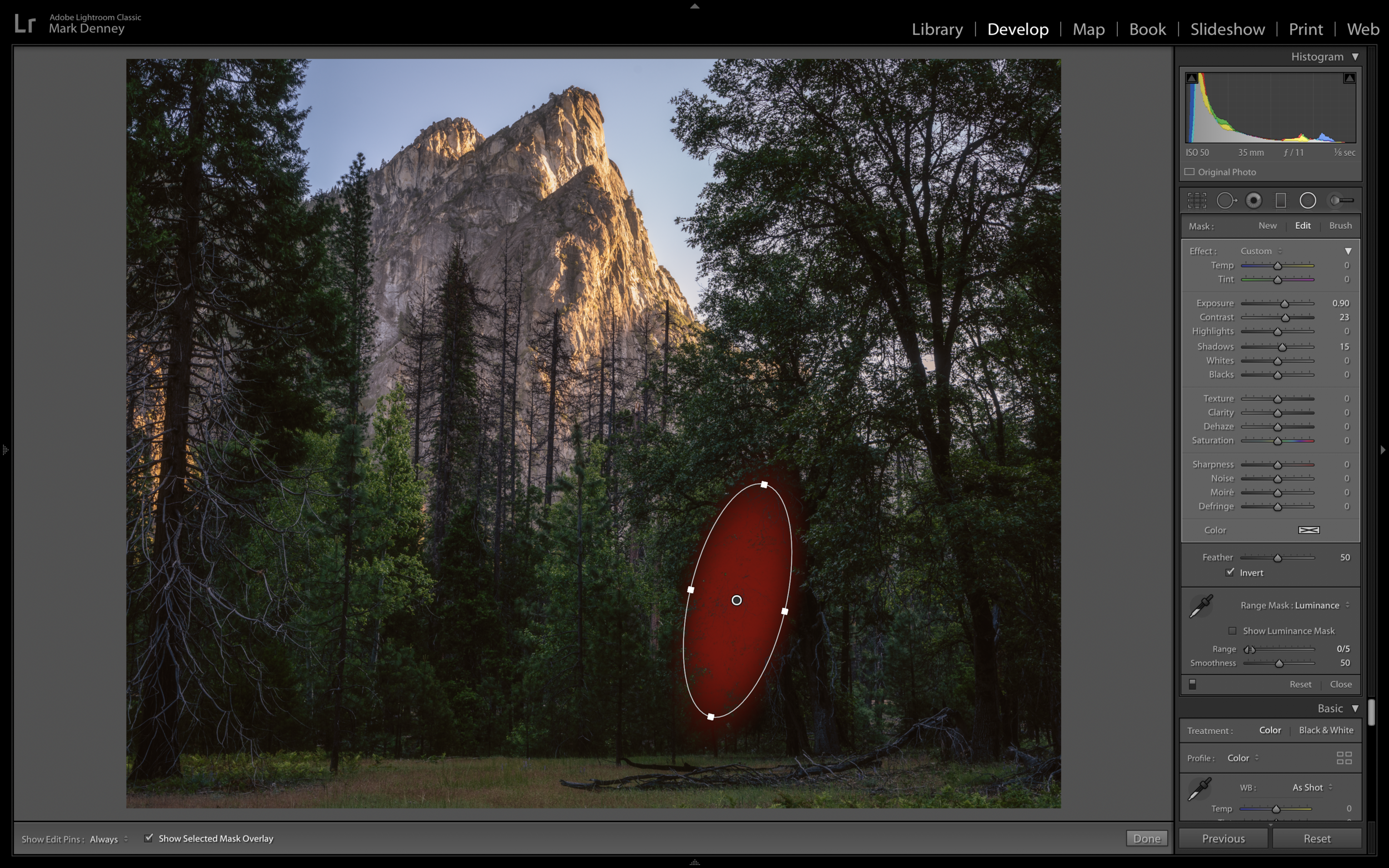
This doesn’t happen too terribly often, but when it does it can absolutely ruin your photograph. This occurs when there’s a large area of your image in deep shadow that appears to be a blob of muddy darkness. From my experience, using a luminance range mask in Lightroom is a great way to bring out just a touch of detail so the area isn’t quite so distracting. There’s multiple different ways to resolve this by using local adjustments inside of Lightroom, that way you don’t have to make any global adjustment that impact your entire image in an effort to fix a singular area.
#2 Dim Light
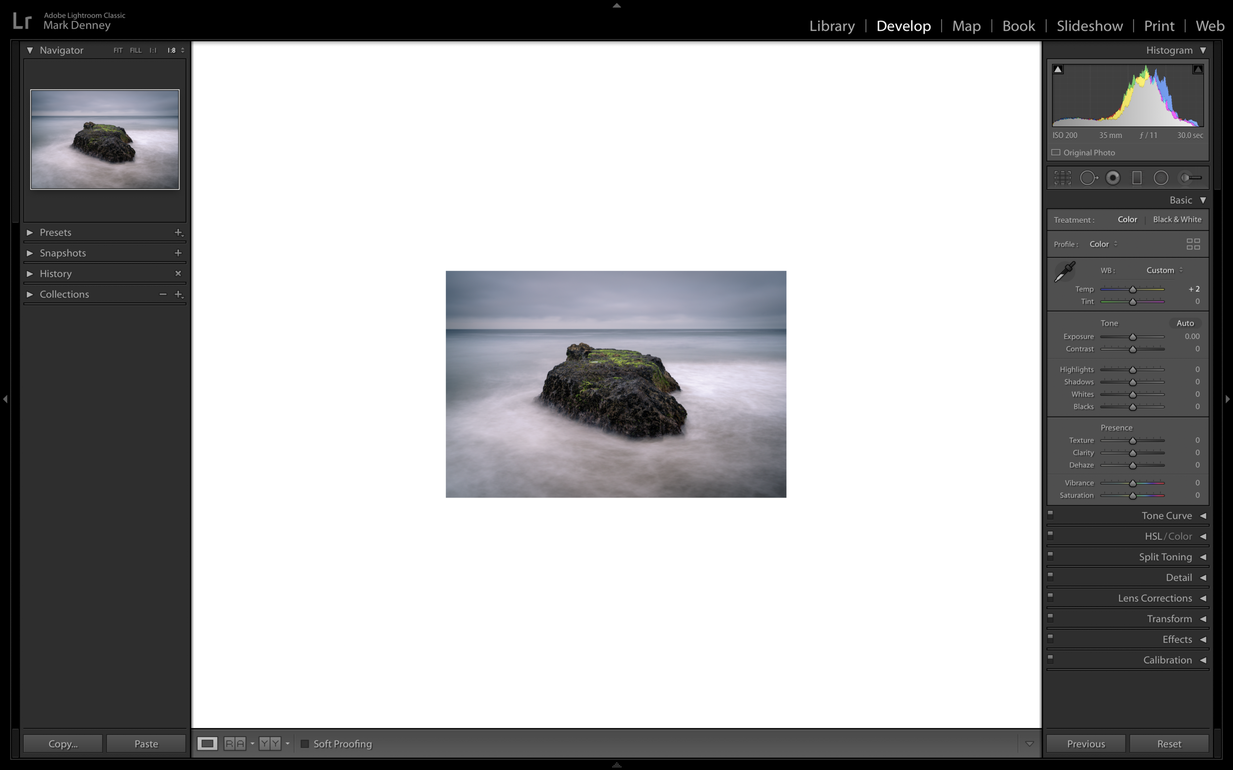
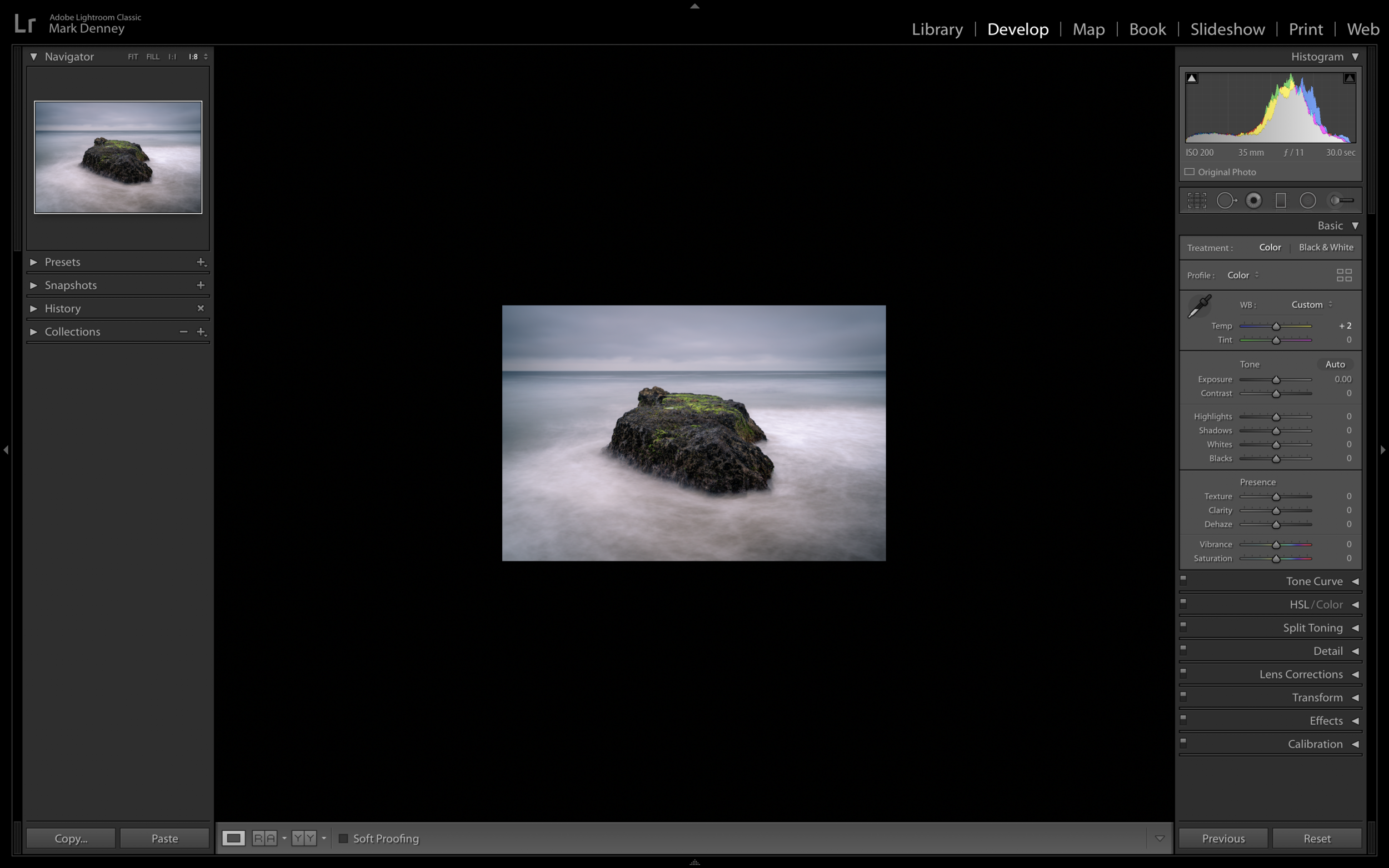
This has plagued me from day one and I’m not certain as to why I struggle with it so much, but I almost always under expose my images too much during post processing, but this trick has certainly helped me to resolve this issue. I usually will under expose my images a touch while on-location, but when I get the images home I often struggle with accurately correcting this in post. The trick that helped me solve this is when you’ve completed your edit and just before you export your photograph, change the background color surrounding your image to white and give your eyes a minute to adjust, then change the background color to black. This extreme swing in brightness will provide you with a better frame of reference to determine if the exposure of your image is appropriate or if it requires additional tweaking.
#1 Contrast Deficit
Contrast is one of those things that can really make or break your photo. Too much contrast and your shadows get too dark and colors become over saturated, too little contrast results in an overly washed out and flat looking image. My common struggle always falls on the latter scenario where I don’t add enough contrast in my images, but by creating a few different scenarios to examine by using the virtual copy function inside of Lightroom you can easily solve this. Using the shortcut (Command + apostrophe) or (Alt + apostrophe on PC) this is an easy way to create virtual copies that way you can review the differing versions in order to determine which looks best. The example below shows an image with subtle contrast in the top left, an image with medium contrast in the top right and an image with strong contrast towards the bottom. In this scenario I felt the image with strong contrast was the winner.
So I hope this article provided you with some useful information that you can use the next time you find yourself in a situation that could be the result of under-editing!
Thanks for reading!
-Mark
Do This Before You Export Your Landscape Photos
I think we can all agree there’s an abundance of information at our disposals with regards to improving ones landscape photography skills. But one thing I feel that’s consistently overlooked is in reference to the stage of the process that occurs after the photo edit is complete yet before the actual export routine begins. There’s so many steps involved throughout the photo editing process that build on one another that it’s easy to accidentally get tripped up. In this article I want to share with you the five things that consistently get by me at the end of my photo editing process and the steps I implemented to solve these oversights if you will - I suppose you could call this the post, post processing process.
1) Exposure
One of the first steps in my editing process consists of correcting exposure, but the problem with this is that there’s many adjustments I apply afterwards that impact the exposure of the image. For instance, when you adjust your shadows & highlights, contrast, or your white & black point, these are all things that also impact your exposure. This intern would always result in my exposure at the end of my edit being vastly different from what I set it at the beginning stages of my processing. The resolution for this is simple, once you finish your photo edit, change the background color surrounding your image to black and take a minute and ask yourself if the exposure still looks correct.
Then switch the background color to white and ask yourself again, does the exposure still look correct? This will provide you with a new frame of reference to determine if you still think your image is properly exposed. (right click on the background area surrounding your photo to change the color)
2) Shadows & Highlights
This issue is similar to the exposure problem where I would update my shadows & highlights in the beginning stages of my editing process. Then after additional adjustments such as contrast, exposure and correcting the white & black point, my shadow & highlight adjustments would no longer accurately reflects my initial calibration. But, fret not as Lightroom has an excellent way of determining if you have overexposed (clipped) highlights or underexposed (crushed) shadows. In other words highlights that are so bright they contain no detail and are pure white or shadows that are so dark they contain no detail and are pure black. The easiest way to access this feature is by pressing the shortcut key J. Anything that’s highlighted in red indicates overexposed highlights and anything highlighted in blue indicates under exposed shadows.
3) Dust Your Photos
Now this one used to get by me all the time and for some reason it would take me months and sometimes years to catch it and it’s dust septs resulting from either something on your camera’s sensor or your lens itself. Thankfully though, Lightroom has one of the best methods for not only identifying these seemingly invisible buggers, but also eliminating them. If you open the Spot Removal tool and check the box in the bottom left hand corner titled “Visualize Spots” this is how you can not only find them, but also remove them.
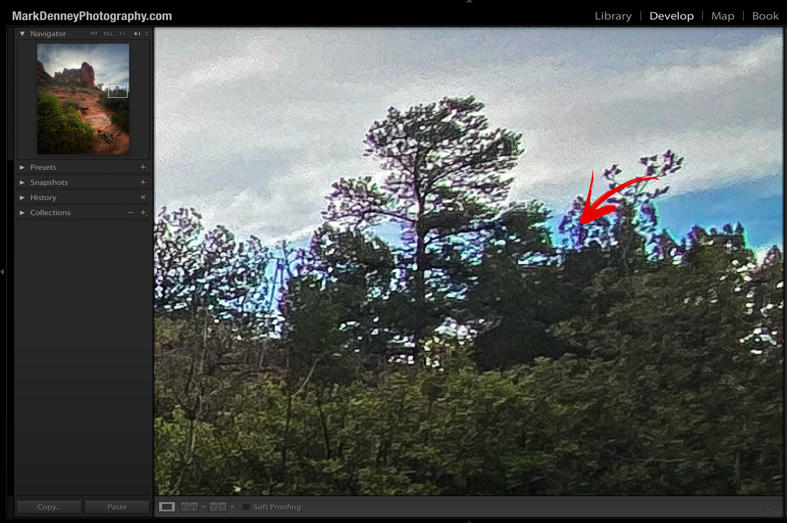
4) Remove The Fringe
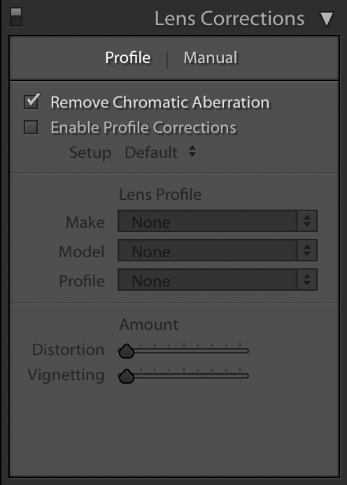
It took me a long time to figure this one out as I always thought Lightroom had it covered when I selected “Remove Chromatic Aberration” in the Lens Correction section. I did this as one of my initial steps throughout my editing workflow and just assumed Lightroom would take care of the rest - well I was certainly wrong!
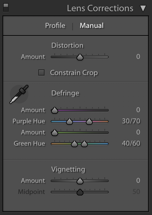
Turns out if you “really” want to remove all the chromatic aberrations, which I’m sure everyone does, then you need to do it by selecting ‘Manual’. It’s a pretty straightforward process of grabbing the eye dropper and dropping it on an area where the chromatic aberration is the worst and Lightroom will make the correction. Once completed you can make any additional adjustments by using the ‘Amount’ and ‘Hue’ sliders below.
5) Flip It
The final “Quality Control” check is, and I know it sounds odd, but flip your image upside down. The beauty behind this is that it sort of takes the image out of the photo - what I mean is that you no longer see the photo as your photo, rather you now just see it as shapes. This is great for checking your composition or crop and also checking for distractions that may be creeping into the edges of your scene.
So that’s my sort of post - post processing process:) It’s basically a quick quality control check before hitting the export button and posting your photos on your website or various social media platforms only to later discover that they contain errors that you missed. I hope this article provided you with some useful information that you can apply to your post processing workflow moving forward.
-Mark
The Best Composition Advice I’ve Ever Heard
Perhaps one of the single most talked about aspects of photography as a whole is related to composition and especially when it comes to landscape photography. I’ve always felt that the best and fastest way to improve your photography is by focusing on composition and that’s exactly what I did when I first became interested in this genre of photography. I consumed as much content on the topic as I possibly could, I read, listened, and watched everything I could find related to perfecting landscape photography compositions. And looking back on all the compositional tips & tricks and best practices there’s really only one piece of advice that stands out that had the single largest impact on my landscape photography.
What’s so important about this piece of advice isn’t solely the advice itself rather why you want to do this that matters most. I was told this golden nugget of wisdom about five years ago, but I wasn’t told exactly why I should do this and wasn’t told when I should do this - I was simply told, “find your focal point and get low”, that was it. I was left to figure out the how, why and when on my own. I spent the majority of the next year trying to figure out the details surrounding this approach and in this article I discuss the many reasons why I think getting low is the best landscape photography advice I’ve ever heard.
#5 Texture
Whenever you have interesting textures in your foreground, that’s a great opportunity to get low to the ground. You don’t necessarily need to lay on the ground, but dropping your camera a bit closer to the areas of interest is a great way of showing off texture. Being able to accurately portray a specific type of texture, for instance sand in a photo, is a very powerful thing as you wont be able to obviously feel the sand in the photo, but if you can “optically feel” the sand it’s a beautiful thing!
#4 Moving Water
This doesn’t only apply to an ocean, it could be a river or a stream, but when you have moving water in your foreground this creates a great opportunity to get your camera low to the flow. This is an excellent way of creating those immersive images where it appears as if the water is flowing directly into the viewers perspective.
#3 Reflections
Reflections are a great way to create symmetry, balance and harmony within your landscape photographs. Getting low to whatever is reflecting a portion of your image, which is generally water in landscape photography, is a fantastic way of making those reflections really stand out and enables you to create powerful eye catching images.
#2 Enlarge Foreground
This is perhaps one of my favorite reasons to get low, especially if you happen to be using a wide angle lens. If you have something interesting in your foreground getting low and up close to it with your camera is a great way to exaggerate the size of the foreground interest and ensures that it becomes a focal point in your image.
#1 Create Depth
And, for my top reason for getting low! It’s great for creating separation between the foreground, mid ground and background layers of your scene. What happens many times when you’re shooting at eye level is that you miss out on capturing any foreground in your image, therefore you’re left with mid ground which often will blend into the background. This will almost always result in an image that lacks depth and separation between the layers of your photo. Being able to create a three dimensional effect with a two dimensional object like a photograph is something I always strive for and by just getting a bit lower is a great way to accomplish this.
Those are the 5 reasons why I think getting low is the best landscape photography composition advice I’ve ever heard. I hope you were able to get some useful information out of this article that you can apply to your on-location photography workflow moving forward.
As always, thanks so much for reading & sharing!
Mark


