One of the more difficult aspects of post processing is identifying when you’re starting to over edit a photo. It’s common knowledge what many of the characteristics of an over edited image are, but determining when you’ve gone too far - that’s the challenging part. In this 14-minute video, I breakdown five tips that have helped me to understand and identify when I’m beginning to over process an image.
Sign #1. Unrealistic Shadows & Highlights
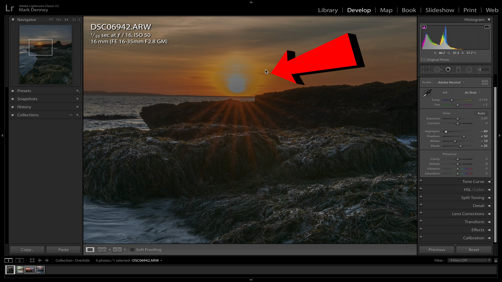
A common issue with landscape photography is when you’re shooting into the sun and either you overexpose the sun, sky, or both. A quick tip before you make any adjustments is to change the profile from Adobe Standard to Adobe Neutral. Adobe Neutral is a flatter profile that’ll give you more latitude in recovering clipped highlights or shadows.
In order to resolve the overexposed area, if you reduce the highlights to a point that you begin to see an unnatural ring around the sun then you’ve gone too far.
On the opposite side, if you’re increasing the shadows to a level that your image begins to loose structure and appears flat, you’ve once again gone too far. Shadows are an important aspect of an image as they add three dimensionality and structure and should be preserved.
Sign #2. Adding Too Much Contrast
Contrast is king and can certainly make or break a photo so understanding when you’re going overboard is critical. Too little contrast and your image appears flat and lifeless, too much contrast and you lose detail in your shadows and your image looks muddy.
When making contrast adjustments keep a close eye on your shadows, when you begin to lose detail in the darker areas of your photo, reducing the contrast could be in order - unless that’s the look you’re going for.
Sign #3. Over-Sharpening & Clarity
This could be the most common issue amongst over edited landscape photos, and it’s also the easiest to identify. To see the affects of over sharpening you have to do a bit of “pixel-peeping” - zoom in and look for a glow or halo along an edge when you toggle the sharpening on and off. If your edges are glowing then you’ve applied too much sharpening or clarity to your image.
Sign #4. Extreme Vignetting
As with much of photo editing, a vignette is meant to enhance a photograph and not distract. If the first thing you notice when you look at your photo is the vignette then you’ve gone too far.
When I’m looking to direct the viewers eye, I’ll create a custom vignette using an inverted radial filter in order to place the center around the actual subject of my photo. I find this approach to be more intentional as opposed to the standard vignette tool available in the ‘Effects’ panel within Lightroom.
Sign #5. Oversaturated Colors
In my opinion, this is the most difficult adjustment to identify when it’s starting to look garish. There isn’t an easy way to determine this, but if you zoom into an area where you can see fine detail and turn the saturation all the way up, you’ll notice that most of the detail is lost.
Outside of this though there really isn’t a definitive way of identifying over saturation outside of just using your best judgment to replicate the natural colors you saw when you captured the photo.
I think many of us have fallen victim to these signs of over editing at one point or the other, I know I certainly have, but it’s all part of the learning process.
Mark


